moey! is the first mobile-only Portuguese digital bank.
Created in partnership with world leading companies in the fields of technology and payments, such as Mastercard and Microsoft, but also with some of the most innovative and disruptive fintechs in the world, such as Meniga or MeaWallet.
MY ROLE
I managed the UX/UI team of moey! app.
I led four major features from continuous improvements, bank products such as credits and insurances and most recently a big UI revamp.


Research
Requirements
definition
Conceptual definition of the project
Layout production and iterations
Handoff and
Design System updates
Usability tests
Design Review
IDEAL PROCESS
APP OVERVIEW
FEATURES


Making payments and transferences effortlessly
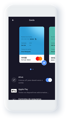
moey! provides the quickest transfers and payments in the market. Not only it works with contactless technology, as it’s the first solution of its kind in Portugal supporting Apple Pay. moey! is also integrated with MBway, offering users another simple way to send and request money. Between moey! accounts, transferences become even simpler.


How to get a Credit without leaving home
Moey! does not have physical stands. So the experience has to be extraordinarily crafted. Not to mention, that everything that has to deal with money, specially credits, makes a person more sensitive. Therefore, for this project we did some interviews to understand users painpoints and what their main concerns.
Dark mode is king 👑
Moey! went from having 2 modes to go solely to dark mode!
Here is why:
TRENDY
92% of android users use some kind of dark mode on their phone
FOCUS
Dark mode highlights on-screen elements, helping the user to focus on what matters most
COMFORT
Some studies* show that dark mode reduces discomfort link

For more info: